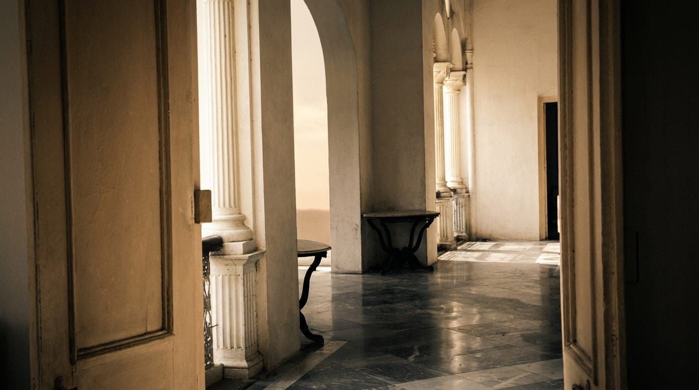
The mark, drawn
from the house.
Sabo's identity is not invented. It is taken from the architecture of the Bhawan itself — proportions, materials, and a sense of restraint inherited from the rooms it represents.
Inspired by the pillars of the Bhawan.
The SABO mark is rooted in the architectural language of the house. The single-stone, semi-Corinthian pillars — sourced from the quarries of Chunar — reflect permanence, precision, and quiet craftsmanship.
More than structural elements, these pillars shape the experience of the home. They frame rather than enclose, creating openness while guiding movement through courtyards and verandahs. The wordmark carries that same quality: structure and openness, weight and air.
The typography balances structure and openness, bringing permanence and precision, while gentle curves lend warmth and ease — making the mark feel inviting rather than imposing. It does not overstate; it remains composed, mirroring an experience of Banaras that is immersive yet unhurried.

The letters, set against the pillars they came from.
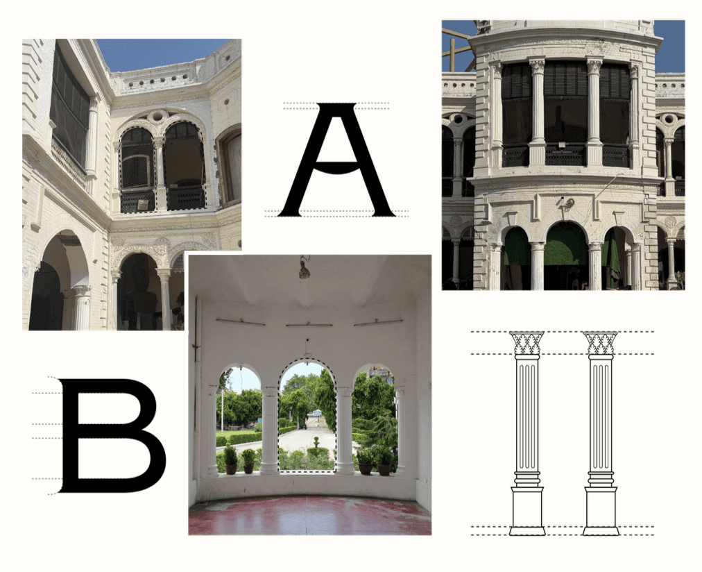
The mark is the house, set in type.